Branding for a German EV/PV firm
Join the energy transition
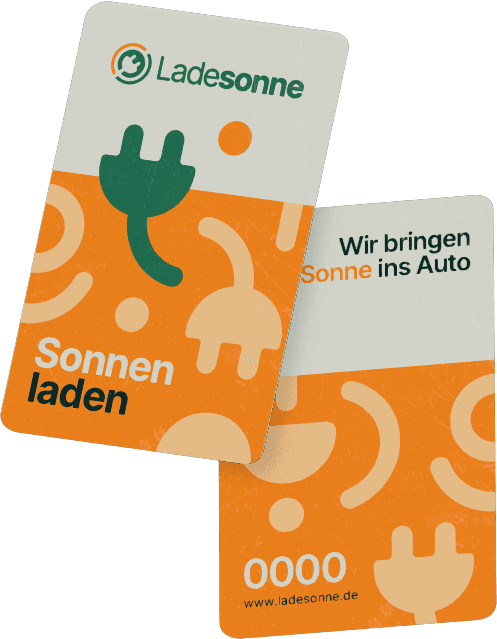
Working as a consultant with a German team, I redesigned the whole personality of the company from the ground up. I sought to give the company more visibility with their users by expressing the startup's spirit in the display of the charging stations, the cards, their website, and their stationery.
This required first understanding their business model and vision to bring clean and public energy into the electric cars of the population of the northern German state of Bremen. Close collaboration with the team while communicating in German was necessary to present design proposals to understand the main problems to be solved and receive feedback from them.
Plugging in
Redesigning the website was one of our main priorities to bring new life to the previous version that looked outdated. In order to have a more flexible identity that could adapt to the different surfaces where the brand's presence would appear, I proposed a pattern of geometric shapes that played with the logo and the plug.
Trying to renovate the company's online presence, a website that prioritized single-page structure was also important, as well as providing responsiveness. It was necessary to collect the previously existing copy and information to present it in a fresh and more accesible way.
Conclusion
Tackling this project from Branding to Web Design and Graphic Design proved challenging, since I had to manage the workload in a limited timeframe and communicate in German with the team. Constant presentations built the backbone for providing transparency and iterating on the designs so the team wasn't taken by surprise and we agreed on the general orientation of the visual direction.